Blog
The Docs Have Been Redesigned
After years of accumulating dozens and dozens of new articles and settings and essentially resembling one huge wall of poorly-organized links, the documentation page has been refactored to be more approachable for first-time users of the project. The index of the documentation page now sports an array of illustrations that abstractly depict each given feature. You can click into each section to see the child articles.
However, if you've grown accustomed to the old documentation and prefer one huge table-of-contents, then move your mouse on over to this icon:
This will convert the docs page into a hierarchy of links, all accessible from a single page. Upon subsequent visits to the docs, the site will remember your preference. The groupings of each article are different before, so apologies if it requires a bit of relearning.
We plan to implement a search feature, probably with Algolia. Until then, please make due with your browser's Cmd/Ctl+F functionality on the table-of-contents page.
Best of all, there are more interactive demos with runnable source-code, which can be edited in CodePen. The end-goal is to make runnable code samples available for every single setting, and we're off to a good start. The demos are listed on the right hand side of each section and are linked-to from various sub-articles.
Visit a docs section with demos along the right side »
The docs are hosted in a GitHub repo. Contributions are more than welcome!
Please leave a comment with your reactions and suggestions for the new docs. We would love to hear how we can make them better!
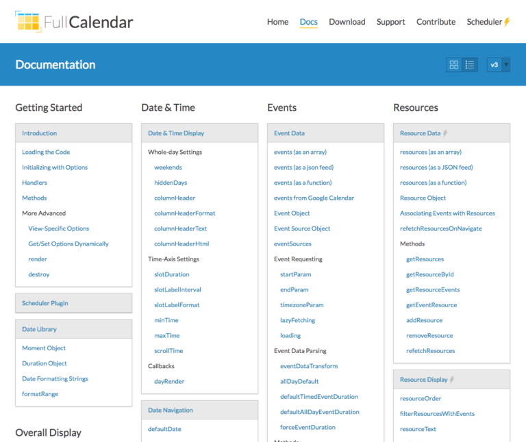
Update (March 10th): based on feedback, the "hierarchy of links", the mode for powerusers, has been redesigned to fit more links on the page. See this screenshot:
