An Engineer Redesigns the Company Homepage
I always have my trusty graph paper notebook by my side. I use it for drawing diagrams I won’t be able to understand a day later. I’m a solopreneur for the open source project-turned-business FullCalendar, and scribbling notes and diagrams has become a staple of my workflow.
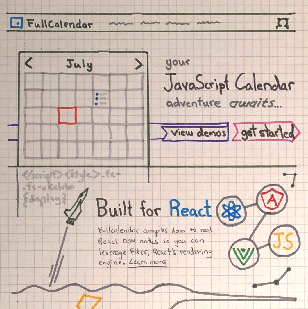
I needed to redesign FullCalendar’s homepage, so I began scribbling like I normally do. What started as a boring wireframe began evolving into something much more illustrative. I raced to my local art supplies store for some color markers.
Just to be clear, I’m an engineer, not a graphic design person. I wasn’t sure if any of these ideas would translate to the screen. After hiring an extremely talented designer, I would find out.
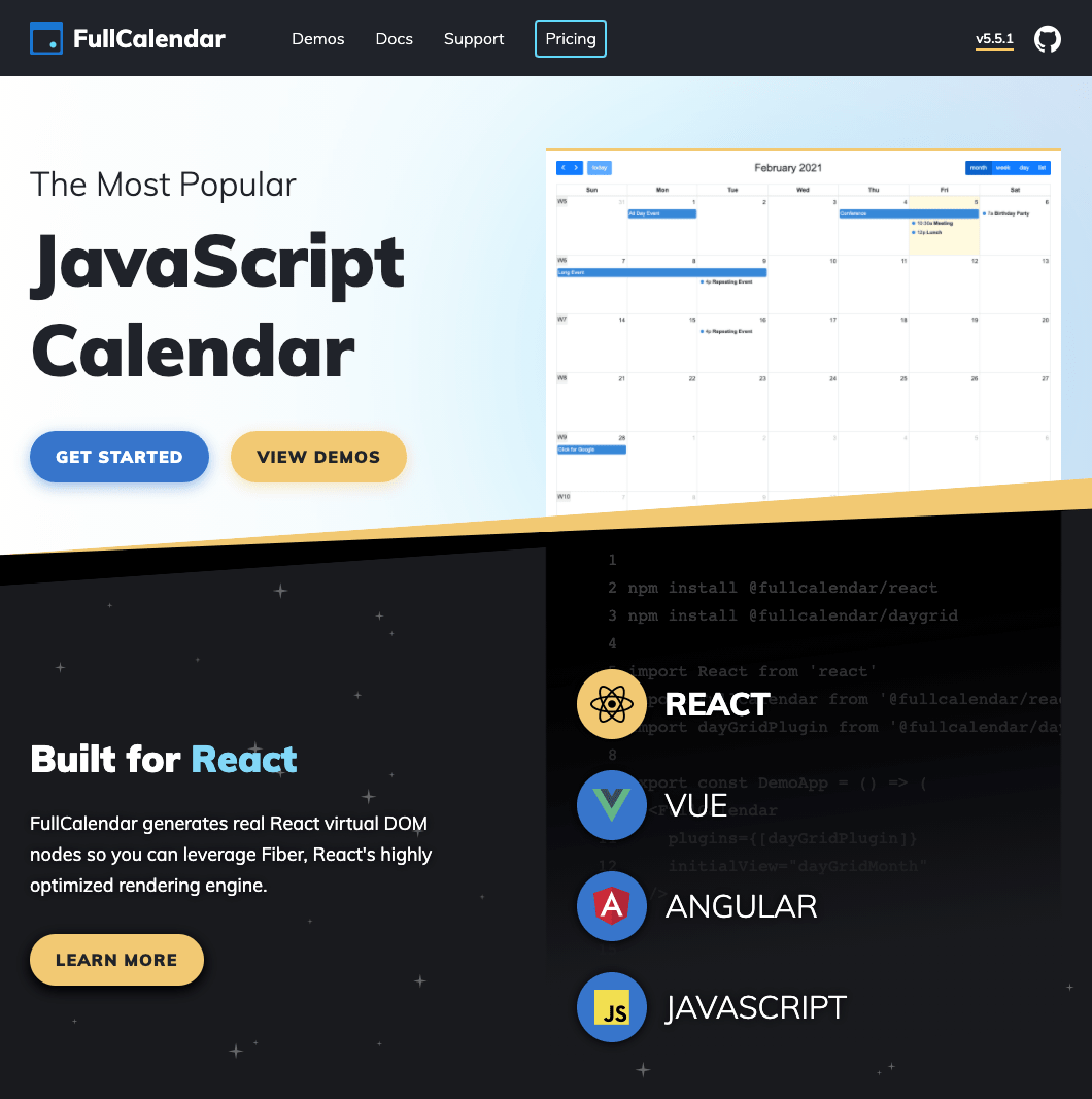
I intended the first section to have a depiction of FullCalendar’s calendar product. It transitions into a Star Wars-esque space scroll of code underneath. Luckily this worked out! What did not make the cut were my unorthodox button and tab styles. They didn’t look clickable:
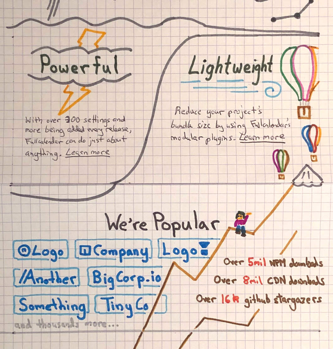
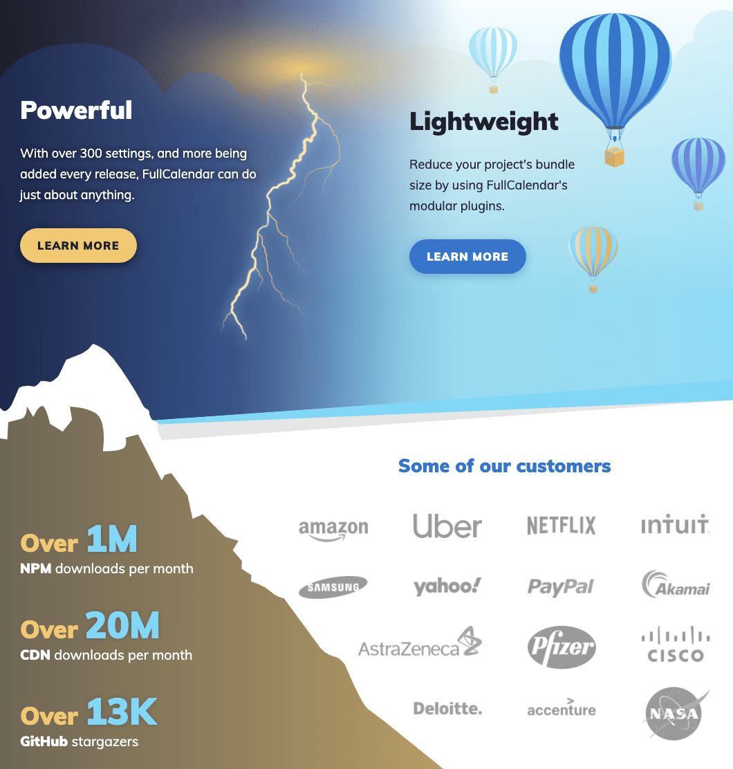
The following scene takes place in the clouds and contains a lightning bolt. My designer and I struggled with numerous cartoony bolts until she recommended a more realistic rendition that is really unique and matches perfectly with the rest of the illustrations.
If you glance below, you’ll see I intended the “sassy emoji girl”  to be
sitting atop the mountain. Unfortunately the mountain was too shrouded in logos to accommodate her:
to be
sitting atop the mountain. Unfortunately the mountain was too shrouded in logos to accommodate her:
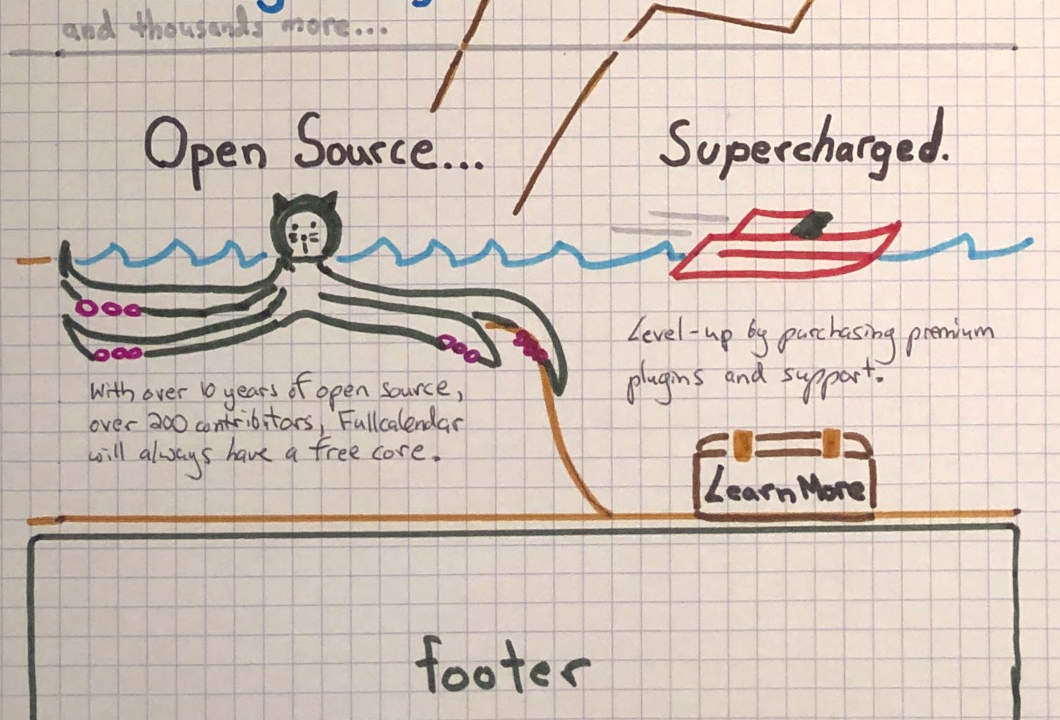
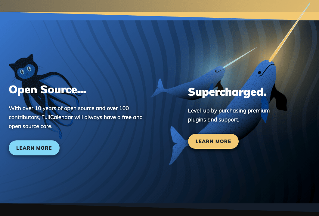
The nautical-themed section that follows contains many elements that were gutted. Only the Octocat survived. My tacky speedboat and treasure chest, which links to the payment page (get it?), were replaced by some ingenious magical narwhals I can’t take credit for:
Working on this design was a breath of fresh air from coding all day. While some may find it a bit too illustrative for an open source project’s homepage, it was an excuse for me to have fun and wear another hat within my company. I’m very curious to hear what others think!
Visit the new hompage! →